Analytics view
The dashboard's Analytics tab is a historical telemetry browser — same data the overview tile shows, but plotted over a configurable time window with each metric independently toggleable. It's the right tool for "what was happening 10 minutes ago" questions that the Logs view can't answer cleanly.
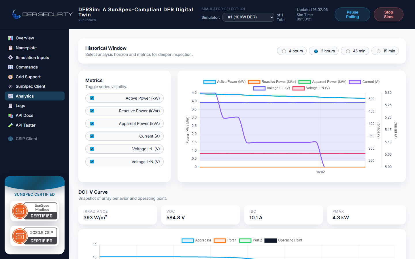
Window selection
Four preset windows along the top of the view:
| Preset | Seconds | Typical use |
|---|---|---|
| 4 hours | 14 400 | Day-shift overview, looking for slow drift |
| 2 hours | 7 200 | Default — covers a typical test session |
| 45 min | 2 700 | Recent activity, mid-test |
| 15 min | 900 | Last few minutes, debugging an immediate event |
The selection is in seconds-behind-now — the chart always ends at the current simulator time. There's no custom date-range picker; if you need historical data older than 4 hours you're outside what the live in-memory buffer keeps.
Metric toggles
Six metrics, each on its own toggle, render against three axes:
| Metric | Default | Axis |
|---|---|---|
| Active Power (kW) | on | power |
| Reactive Power (kVAr) | on | power |
| Apparent Power (kVA) | on | power |
| Current (A) | on | current |
| Voltage L-L (V) | on | voltage |
| Voltage L-N (V) | on | voltage |
Multiple metrics on the same axis stack on a shared scale; the axis appears once per axis-group. Voltage L-L renders as a filled area to distinguish it from L-N in the same panel.
For battery scenarios the SoC chart appears as a second tile — absolute SoC % over the window with the reserve-band shading. For hybrid-DC scenarios the same SoC tile renders for the battery component.
Backing REST surface
The view pulls the same window the dashboard's main page does, via the in-memory telemetry history buffer. The relevant endpoint:
GET /api/dersim/history?seconds=7200
The buffer is bounded — older samples roll off as new ones arrive. The default retention covers the longest preset (4 hours) with a safety margin; for harnesses that need longer retention, push the relevant fields to your own time-series store from the WebSocket telemetry stream.
DC IV curve (PV scenarios)
For PV device types the Analytics view adds a third tile: the Live DC IV curve. This shows the PV array's current operating point on the I-V curve at the current irradiance + cell temperature, plus the curve itself. See DC IV curve for the underlying physics and the standalone REST surface.
When to use Analytics vs the WebSocket
| Use case | Reach for |
|---|---|
| Visual inspection during a test | Analytics |
| Spotting drift over the last hour | Analytics |
| Recording data for later analysis | WebSocket stream |
| Building your own dashboards / alarms | WebSocket stream |
| Backfilling missing samples | Neither — the buffer is in-memory and bounded |
The Analytics view is opinionated about visualisation; the WebSocket is opinionated about being raw. For long-running recording, the WebSocket sample-and-store pattern is what every production-grade test harness reaches for.
Tips
- The metric toggles persist within the tab session — refreshing the dashboard keeps your last selection.
- Switching device (multi-device runs) snaps the chart to the new device's history; the toggles persist across the switch.
- For battery and hybrid-DC scenarios the SoC chart appears below
the power/current/voltage chart. The y-axis is fixed at 0-100 %;
for narrow-band SoC inspection (e.g. cycling test between 50-60 %)
the absolute scale makes the variation visually small. Use the
REST
/historyendpoint and plot externally if you need a tight zoom.